


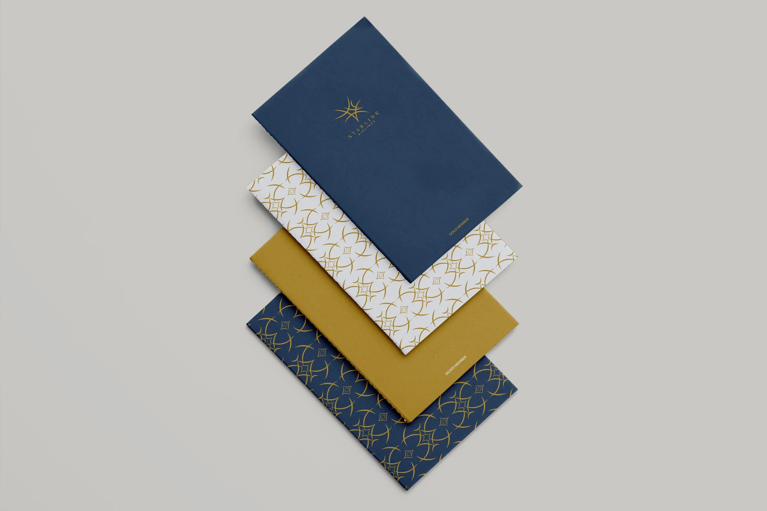
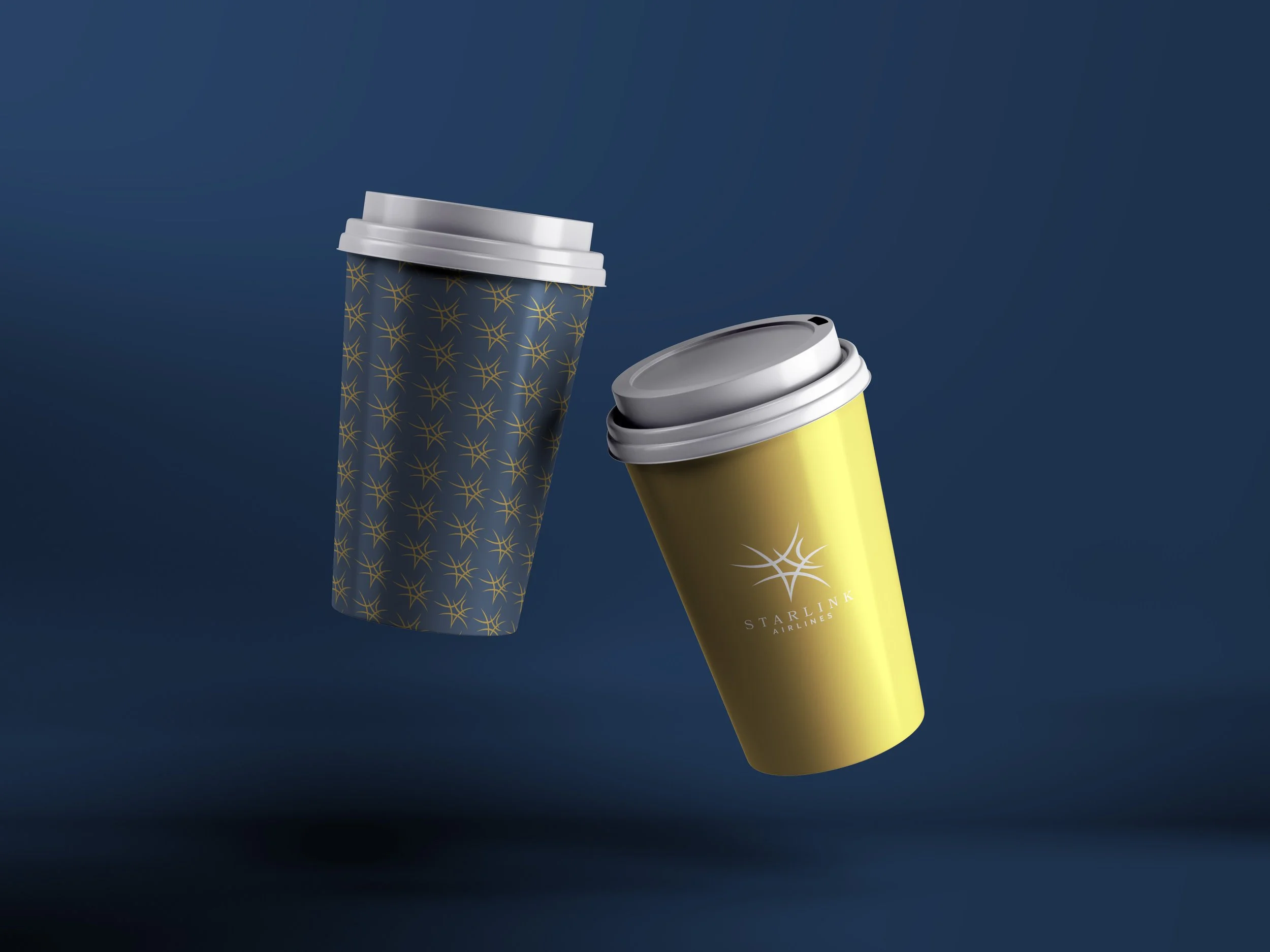
The idea behind this passion project was to bring a luxury airplane identity to life. The name Starlink is to set the vision of traveling from one destination to another in a dreamy, spirited way. Similarly, the logo represents a star almost like a spark, representing the exciting thrill travel can be, as trips can often be looked upon as magical, transformational, and happen in a moment’s notice. More so, the colors are classic, trustworthy, and carry integrity which is highly valued by people whether it’s their first or hundredth time flying.

Branding and
Starlink Airlines
